Creating a calm and peaceful atmosphere in your home starts with the colors you choose for your walls, furniture, and decor. Colors influence mood and energy, so selecting calm shades can help you build a relaxing environment that promotes comfort and tranquility. Whether you’re repainting a single room or redesigning your entire space, understanding how to choose calm colors makes a big difference.
In this post, we’ll explore practical tips to guide you in selecting soothing colors that fit your style and home perfectly.
Why Choose Calm Colors?
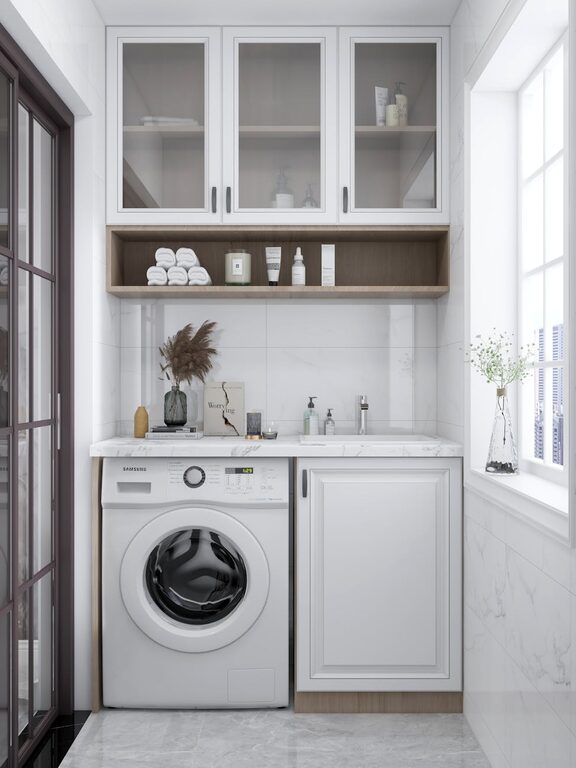
Calm colors are typically soft, muted, or neutral shades that encourage relaxation and reduce stress. They don’t overwhelm the senses, making your home a sanctuary where you can unwind after a busy day. Calm colors are especially beneficial in rooms like bedrooms, living rooms, and bathrooms.
1. Understand Color Psychology
Before choosing colors, it’s helpful to know a bit about color psychology—the way colors affect emotions.
– Blues: Often associated with calmness and serenity. Light blue can evoke feelings of openness and peace.
– Greens: Connected to nature, green is refreshing and balances energy.
– Neutrals: Whites, beiges, and greys provide a peaceful and timeless backdrop.
– Soft pastels: Gentle pinks, lavenders, and peaches add a subtle calming vibe without being dull.
Knowing these basics helps you pick shades that resonate with the mood you want to create.
2. Start with Neutral Base Colors
A simple way to maintain calmness in a room is to use neutral colors as your base. Light beige, soft grey, or warm white walls can make spaces feel open and airy. Neutral backgrounds also allow you to add touches of color through furniture, pillows, or artwork without overwhelming the space.
Benefits of Neutral Bases:
– Versatile and timeless
– Easily paired with other calming tones
– Create a sense of spaciousness
3. Choose Colors with Soft Undertones
When selecting colors, pay attention not just to the main hue but its undertones. For example, a green paint could have blue or yellow undertones—blue undertones tend to feel cooler and more calming, while yellow undertones might feel warmer and more energizing. Opt for colors with cooler undertones to maximize the calming effect.
4. Limit Bright and Dark Colors
Bright colors such as red, yellow, or bright orange are stimulating and can increase energy levels rather than soothe. Similarly, very dark colors can sometimes feel heavy or oppressive. Keep these colors to a minimum if your goal is to create a calm space. Instead, consider using these bolder shades as small accents like throw pillows or artwork.
5. Use a Color Palette for Harmony
Choose a palette of two to four calm colors that complement each other. This approach maintains harmony and balance in your space. For example, you might blend soft blue walls with pale grey furniture and light beige accents for a cohesive look.
How to Create a Calm Color Palette:
– Start with a dominant neutral or pastel
– Add one or two complementary calm colors
– Include a subtle accent color to add interest
6. Consider Natural Light
Lighting plays a significant role in how colors look and feel. Natural light enhances soft colors and can make spaces feel more inviting. Rooms with plenty of sunlight work well with cooler colors like blues and greens, while spaces with less natural light may benefit from warmer shades such as soft taupe or warm grey to maintain coziness.
7. Test Paint Samples Before Committing
Colors can appear very different depending on the room’s size, lighting, and furnishings. Always test samples of your chosen colors on the walls before painting the entire room. Observe how they look at different times of the day to ensure they maintain the calming effect.
8. Incorporate Texture and Materials
Calm colors work even better when combined with natural materials and textures such as wood, linen, or cotton. These elements add warmth and depth without disrupting the peaceful color scheme.
9. Use Color Psychology to Match Room Purpose
Think about how you use each room and choose calming colors accordingly:
– Bedroom: Soft blues or lavender encourage rest and relaxation.
– Living room: Light greens or warm neutrals can create a welcoming atmosphere.
– Bathroom: Pale turquoise or mint can evoke cleanliness and freshness.
– Home office: Muted greys or soft beige help in concentrating without feeling overwhelming.
10. Don’t Forget the Ceiling and Trim
Calm colors aren’t just for walls. Painting your ceiling a soft, light color (often a shade lighter than the walls) can add to the serene feel. Similarly, choosing coordinating trim colors ties the entire look together without harsh contrasts.
Final Thoughts
Choosing calm colors for your home is a rewarding way to enhance comfort and well-being. By understanding color psychology, starting with neutral bases, considering light and undertones, and thoughtfully combining textures, you can create a peaceful, beautiful space tailored just for you.
Remember, the process takes patience and testing, but the resulting tranquility is worth every step. Happy decorating!